Hi guys!
I've finally got my own website and I really think you should check it out! It's got some better images of my work that I haven't put up here. I hope you like it.
See it at: cassiebrock.com
Tuesday, September 18, 2012

MMXII
I was lucky enough to travel to Prato, a small Italian town just twenty minutes out of Florence, with a group of students from university. It was possibly one of the most amazing experiences of my life so far.


Sunday, August 19, 2012
Duc D'Orleans
Duc D'Orleans is a fancy ice cream company I invented for yet another brief. This time we had to create a whole identity from scratch. This is what I came up with.


Lost! and Found!
A series of stamps and booklet commemorating Douglas Annand, an Australian design icon from the past.
 |
| The stamps. |
Eight Annual Report
This time we had to create an annual report on a company we made up. I chose to do a TV station that I called Eight. The design was based on those old test transmission screens on analog TV. The photos were taken of my TV while this amazing midday movie was playing. I forgot to take the name of it, so if anyone out there recognises it, let me know!

The Waitress
This was done for the ISTD student awards. The brief was to illustrate Jack Zipe's 'The Waitress' using mainly typography. Since The Waitress is a fairy tale written by a modern author I wanted to use the same sort of decorative style that manuscripts from the past used, yet in a fresh, clean way. I'm super happy with how it came out.

Monday, January 16, 2012
The Animated Still
This brief was to come up with a brochure based on movie stills, which was also had to create ourselves. I decided to try to make one dedicated to animated movies so I could do a little bit of illustration.


Zines
For this brief we had to create a set of 3 zines. I chose to base them all on cake recipes. Each one would be a different cake to make. I was sort of trying to bring a 60's housewife vibe yet make it modern.


Museum of Alchemy
Well, it's been a while, but I thought I'd finally put up some of the projects I did last year that I never got the time to post.
This project was based on creating a stationary set for an obscure museum that we could make up. I chose one that exhibits anything related to alchemy because I thought it might be fun to play with the symbols they use and also try and I also thought that trying making something with an air of mystery about it would be an interesting challenge. Besides the basic stationary; business cards, letterhead and enevelop, we had to make one other object, so I chose to design the packaging for a 'grow your own philosophers stone' kit.


This project was based on creating a stationary set for an obscure museum that we could make up. I chose one that exhibits anything related to alchemy because I thought it might be fun to play with the symbols they use and also try and I also thought that trying making something with an air of mystery about it would be an interesting challenge. Besides the basic stationary; business cards, letterhead and enevelop, we had to make one other object, so I chose to design the packaging for a 'grow your own philosophers stone' kit.


Monday, September 12, 2011
Hand Tool
Ok, so this on was really fun too! We had to design a poster based on our favourite hand tool. It could have been anything from a pencil to a spork. I chose a pen because it's what I use for pretty much every project, wether it's just in the begining sketches or, like in this one, the whole project. I set up this landscape as a kind of diarama thing and I really liked playing around with the 3D elements


Phobias
I've got a lot to upload today since I've been so busy over the last month or so! For out Illustration as Design class we had to come up with a series of book covers each dedicated to a different phobia. I'll let you see if you can figure out which phobias these are yourselves.


Huckleberry Finn
The brief for this one was to create a poster based on a musical using pretty much only type. I've been wanting to try hand drawing type for ages and I had heaps of fun doing this one.


Thursday, June 9, 2011
Caulfield Library
So this project we were given the task of redesigning the library signage for the Monash Caulfield Library. Just hypothetically of course.


Saturday, May 7, 2011
Marco Polo
For this brief I had to do something way out of my comfort zone which was create an animation or a story board for an animation.
It was for a made up channel that could be about anything we wanted. I chose a travel one and called it Marco Polo after the explorer and also the kids' game. In the end, since I didn't know anything about how to animate I went for the story board option. This is it as a gif, which has been quite tough on the colors, but I don't know what to do about that.

It was for a made up channel that could be about anything we wanted. I chose a travel one and called it Marco Polo after the explorer and also the kids' game. In the end, since I didn't know anything about how to animate I went for the story board option. This is it as a gif, which has been quite tough on the colors, but I don't know what to do about that.

[CLICK IMAGE TO VIEW]
Thursday, March 31, 2011
The Ladykillers
So I haven't had a chance to upload any of my old stuff yet! But soon.
This brief was for my typography class. You had to choose a movie that was playing at the astor theatre (they play a mix of old and new films. I've heard it's a pretty cool place. I want to go) So I chose The Ladykillers, the 1955 version not the newer one with Tom Hanks, because I really like the style of some of the movies from that time, and also its a black comedy which is always fun to work with. Then with that movie you had to design a set of eight lobby cards.
This is what I came up with:

The frames are on angles because of the lopsided pictures in the old lady's house. The background is meant to be like the wallpaper and I wanted all the scenes to look as if they've just been interrupted. You might not be able to see very well but in the last image, the title one, there's a reflection of the scarf guy in the newspaper one. If you've watched the movie you might know who it is.
This brief was for my typography class. You had to choose a movie that was playing at the astor theatre (they play a mix of old and new films. I've heard it's a pretty cool place. I want to go) So I chose The Ladykillers, the 1955 version not the newer one with Tom Hanks, because I really like the style of some of the movies from that time, and also its a black comedy which is always fun to work with. Then with that movie you had to design a set of eight lobby cards.
This is what I came up with:

The frames are on angles because of the lopsided pictures in the old lady's house. The background is meant to be like the wallpaper and I wanted all the scenes to look as if they've just been interrupted. You might not be able to see very well but in the last image, the title one, there's a reflection of the scarf guy in the newspaper one. If you've watched the movie you might know who it is.
Tuesday, March 22, 2011
Peter Pan
Hah. Well, that drawing a day didn't exactly go to plan, but that's ok. I've recently started uni and one of the classes asks for a drawing a day so hopefully that'll keep me practising!
Anyway, I thought that maybe I'd turn this into not just a illustration blog but a design blog too!
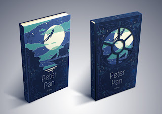
Which I'm pretty happy with. This is only a quick digital mock up, later I hope to take a proper photo of it. So the window on the jacket is meant to be like the window in the nursery that they fly out of to start their adventures. Hope you like it!
I've just finished our first project for the Graphic Design class. The brief was to design a book cover/jacket thing. When we first got the brief they showed us examples of what students had done before and they. were. so. good. So good! It was terrifying!!
Anyway I decided to do Peter Pan for my book. And I new I wanted to do something illustrative and have the jacket and the book cover somehow interact. So I came up with this:

Which I'm pretty happy with. This is only a quick digital mock up, later I hope to take a proper photo of it. So the window on the jacket is meant to be like the window in the nursery that they fly out of to start their adventures. Hope you like it!
Maybe later I'll post some work I did for the course I did before this?
Thursday, February 10, 2011
Roses in their Eyes
Wow. First Post! So, I guess I should introduce myself or something? Well, I'm Cassie and I'm a graphic design student from Melbourne. I used to draw a heap as when I was younger but the last two years or so I've hardly drawn at all, so I'm hoping to do a sketch a day thing for a while.
I am notoriously bad at keeping up with these sort of things though.
Here's the first picture, it was meant to be just a sketch but then I kept going. I'm definitely a bit rusty, but you know, it has been a while. The name is from a Neutral Milk Hotel song. How could you not like a band called Neutral Milk Hotel?

I am notoriously bad at keeping up with these sort of things though.
Here's the first picture, it was meant to be just a sketch but then I kept going. I'm definitely a bit rusty, but you know, it has been a while. The name is from a Neutral Milk Hotel song. How could you not like a band called Neutral Milk Hotel?

Subscribe to:
Posts (Atom)